Each month, hundreds of comics are released to stores for the hungry masses of fans around the world. To stand out on the shelves, you have to put the great art up front. You can judge a book by its cover.
 Welcome back to our continuing monthly column. Except for shamefully missing last month due to our live show preparation.
It’s a shame, because controversy kicked off over the Milo Manara cover variant for Spider-Woman #1 late last month, and his future Marvel variants have been quietly cancelled for the moment. What do we think about this, Panelonians? A case of the Internet using its power to stamp out the rampant sexism that is still a reality in the comics industry, or an artist getting backlash for providing what he has been known for producing for decades? The artist responded to the Internet criticism “I have to acknowledge that what I think is a beautiful picture, nice, attractive, seductive – that is exactly my purpose, or what I want to achieve – for some others is disturbing. But this is something that I have to consider every time. And in some ways, I am more and more surprised.” This debate is one that we can’t adequately deal with in this brief column, where we aim to celebrate our favourite covers each month.
So the high quality of this month’s cover art has brought us back to the Panels Cave to talk about some art. It’s a month where DC went 3D and Deadpool trolled them for that. There’s light and shadow, and some surrealism in between, but not before we see a sandwich on a pitchfork.
This is Cover Story.
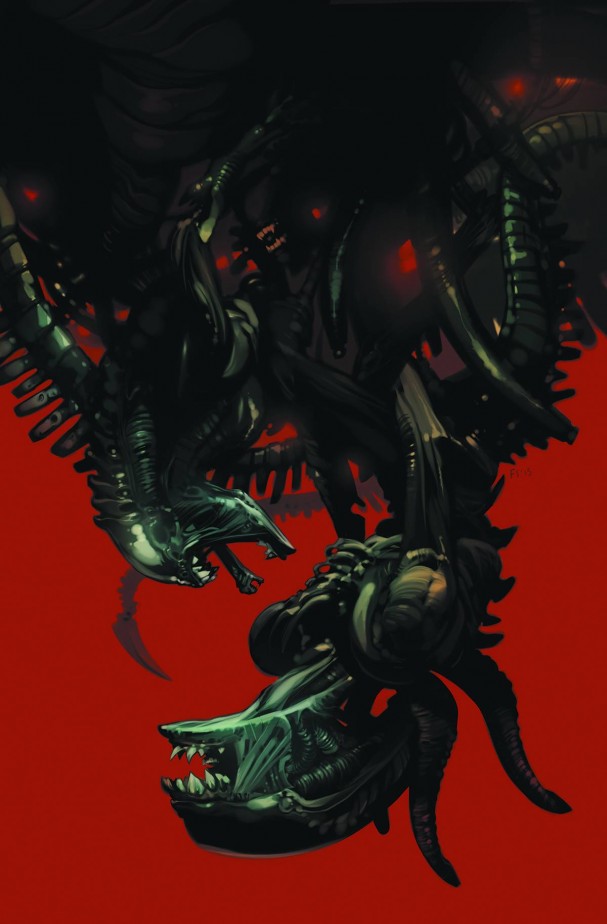
Aliens: Fire and Stone #1 (Dark Horse) – Artist: Fiona Staples
Fiona Staples has been knocking beautiful covers and interiors out of the park on Saga since 2012, so it is terrific to see her cut loose on something even more terrifying that Prince Robot on Sextillion. Like she does with her Saga covers, Staples allows a distinct figure to stand out against a primary coloured background. Humans are trained to react to red as a colour of danger, and if several decades of cinema has taught us anything, the Xenomorph is something to fear.
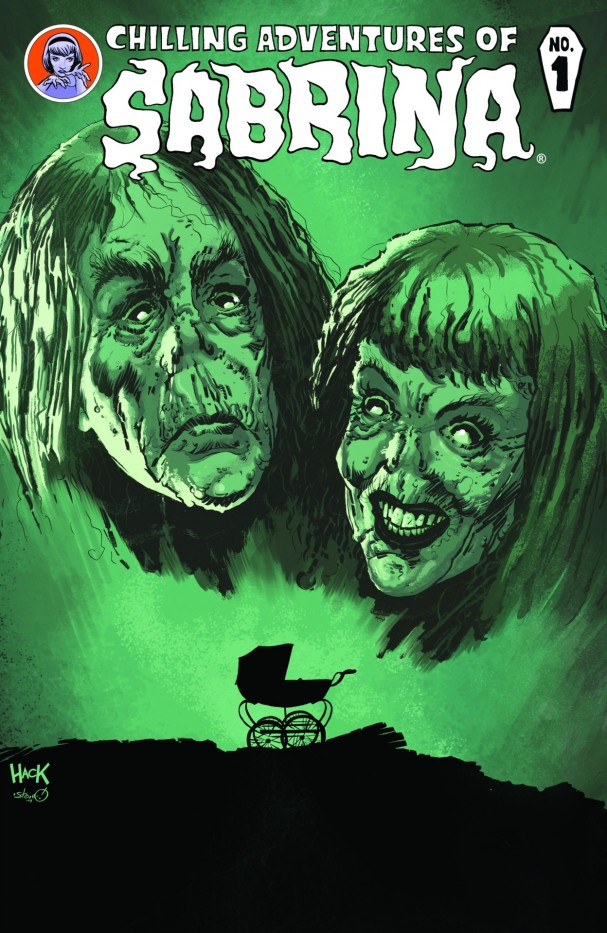
Chilling Adventures of Sabrina (Archie Comics) – Artist: Robert Hack
Archie Comics have turned into something to watch over the last few years, and Afterlife with Archie took us into a Danse Macabre with the kids of Riverdale. As the publisher embraces this new image, a new Sabrina title is launched in a similar vein. Artist Robert Hack draws on one of the most iconic horror posters of the 20th century, with Rosemary’s Baby immediately telling us that this one will chill us to the bones.
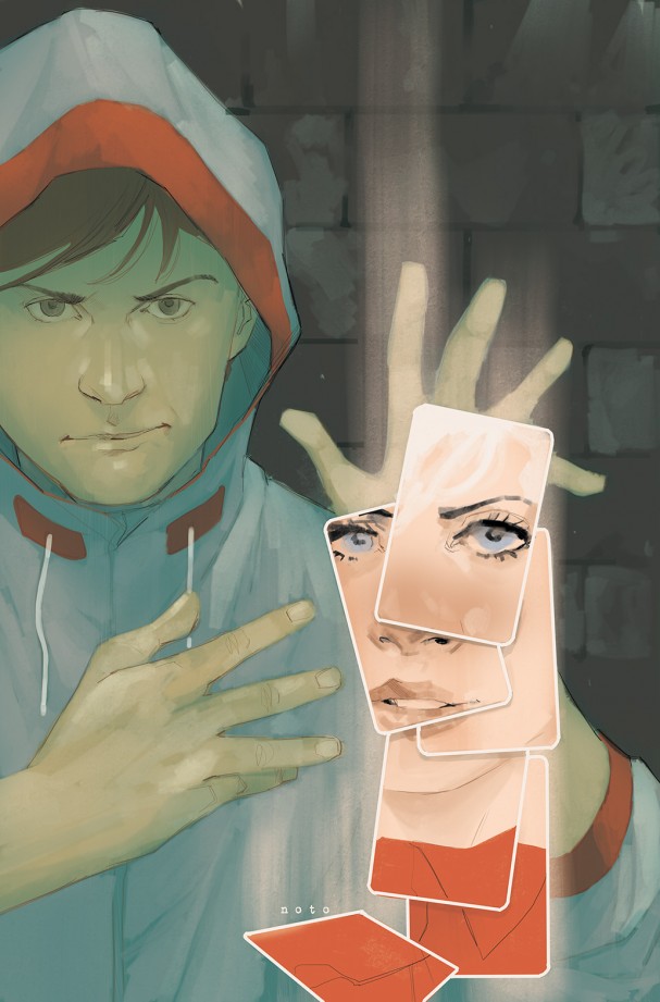
Cloaks #1 (Boom! Studios) – Artist: Phil Noto
Cloaks was one of the more interesting debuts of the month, with the magic theme being used in a completely different way to most similarly themed titles. Artistic magician Phil Noto’s unsurprisingly beautiful cover reminds us that magic is all optical illusions, smoke, and mirrors as a set of tumbling cards form a beautiful face that only Noto could realise.
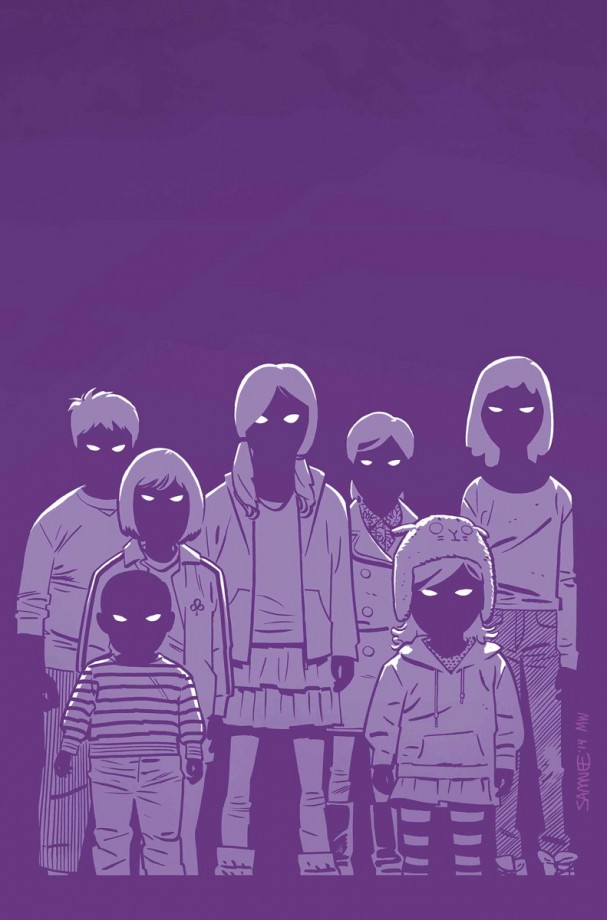
Daredevil #8 (Marvel) – Artist: Chris Samnee
There must be a “creepy vintage horror vibe” in the air this month, with regular Daredevil cover artist going all Village of the Damned on us. Using entirely shades of purple and flecks of white, and not filling in any of the features of the children’s faces, tonight’s dreams will be filled with the spooky grape people that have haunted you since time immemorial.
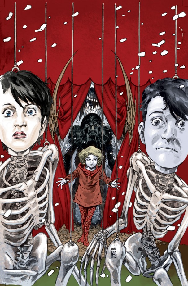
Dead Boy Detectives #9 (DC/Vertigo)) – Artist: Mark Buckingham
“I wonder if one day that, you’ll say that, you care
If you say you love me madly, I’ll gladly, be there
Like a puppet on a string…”
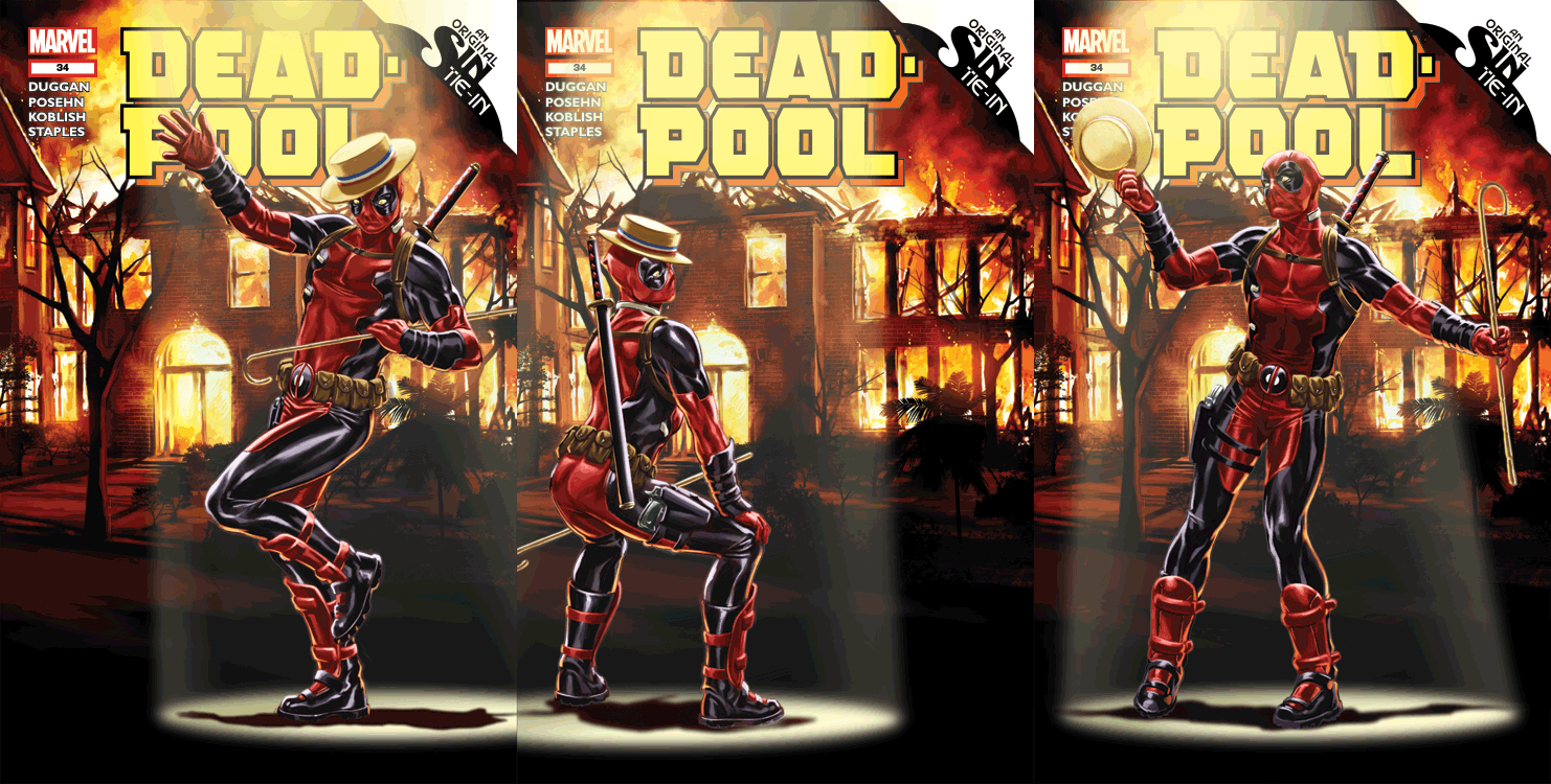 Deadpool #34 (Marvel) – Artist: Mark Brooks
Troll so hard, that it cray – am I right? Attempts at speaking street aside, of course it would be Deadpool that would troll DC’s 3D motion covers this month, poking fun at the “Futures End” covers – with a top hat and cane, no less. Mark Brooks outdoes every DC cover by providing not two, but three distinct poses. It’s hypnotic in it’s own way.
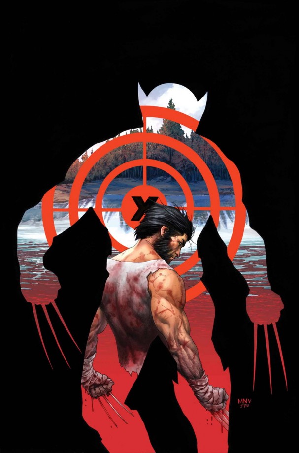
Death of Wolverine #1 (Marvel) – Artist: Steve McNiven
While we cough and giggle at the prospect of Marvel killing off their biggest cash cow, Marvel gives us some beautiful art to look at in the meantime. McNiven is possibly one of the best mainstream artists in the business, and a perfect fit for this arc. Using the cut-out frame that has become incredibly popular this year in covers, McNiven contrasts old and new designs of the iconic character as he reaches his alleged end,
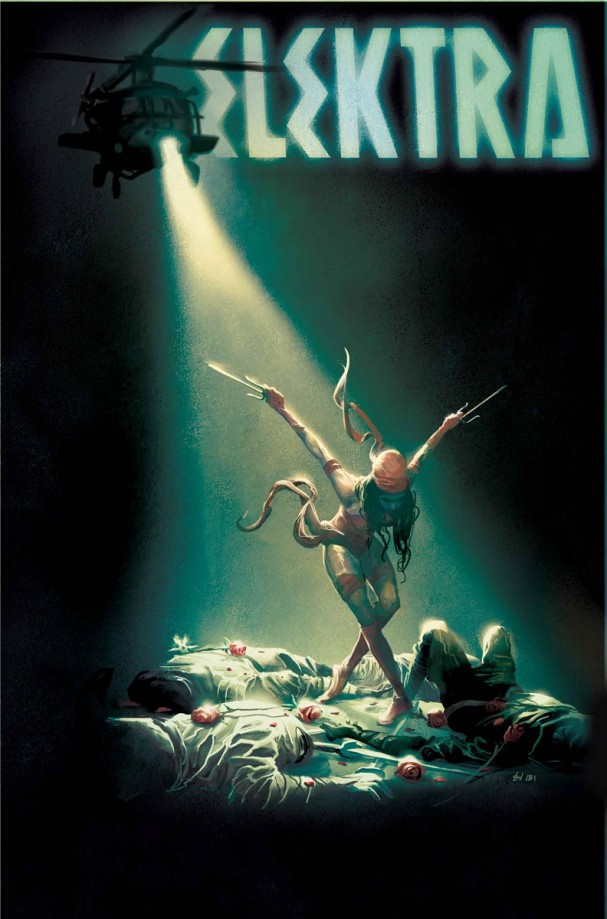
Elektra #6 (Marvel) – Artist: Mike Del Mundo
Take a bow, Mike “Deadly” Del Mundo, for your Eisner nominated cover art (for X-Men Legacy) is something to be proud of. A string of beautiful Elektra covers behind him, this one might just take the cake for it’s incredibly use of lighting, something that is both functional and stylish, working its way from the titles, to the helicopter and then down to bathe the star herself.
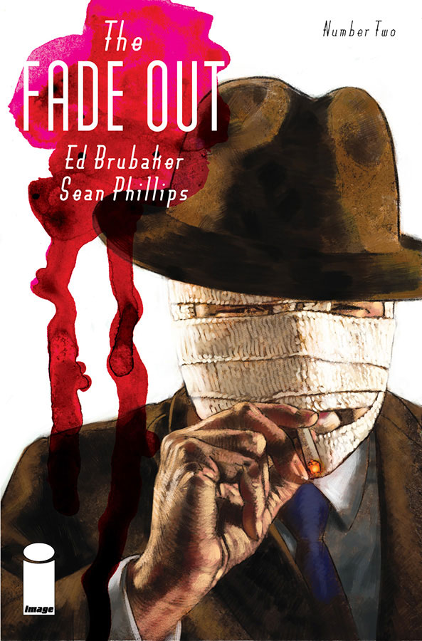
The Fade Out #2 (Image Comics) – Artists: Sean Phillips & Elizabeth Breitweiser
The first issue of this phenomenal book came with a variant cover that was inspired by the magazines of the era, and this one simply highlights the character strengths of the follow-up issue. Both an intriguing visual reference to The Invisible Man and a metaphor for the masks people wear, it’s as compelling as the contents of this instant classic.
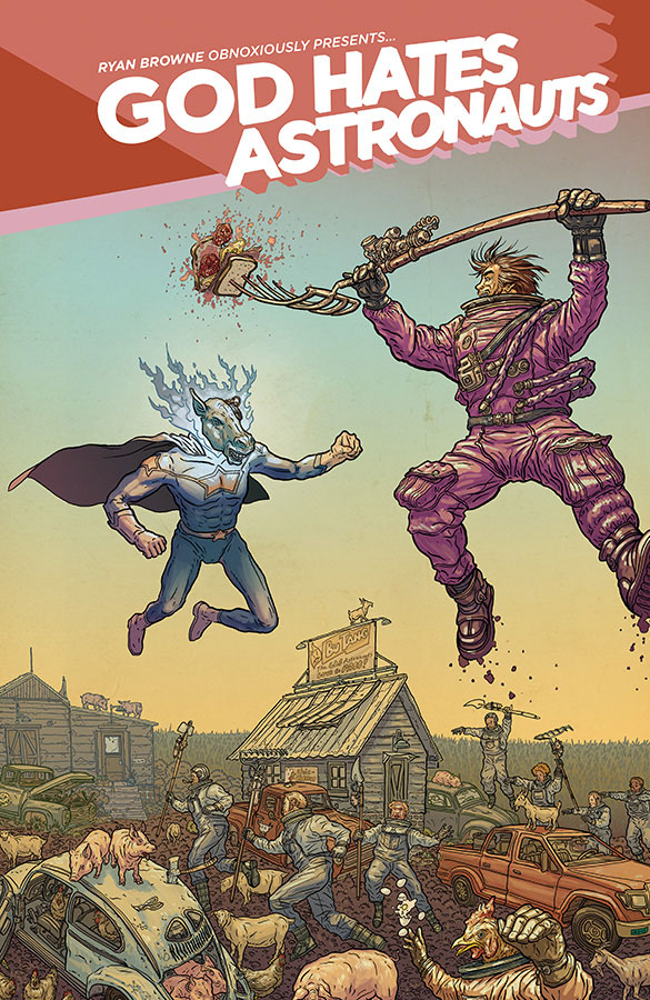
God Hates Astronauts #1 (Image Comics) – Artist: Geof Darrow
God Hates Astronauts, with its King Tiger Eating A Cheeseburger and chicken-marrying astro-farmers, is about as delightfully batty as they come. It feels like Geof Darrow book, so it’s highly appropriate that he tackled the variant cover for this debut issue. Down the bottom, it’s chaos on several sets of wheels in keeping with his style. Up top, an astro-farmer and a ghost cow appear to be locked in battle, the sandwich on the end of the pitchfork being one of those delightfully Darrowesque moments that should instantly sell this monument to madness.
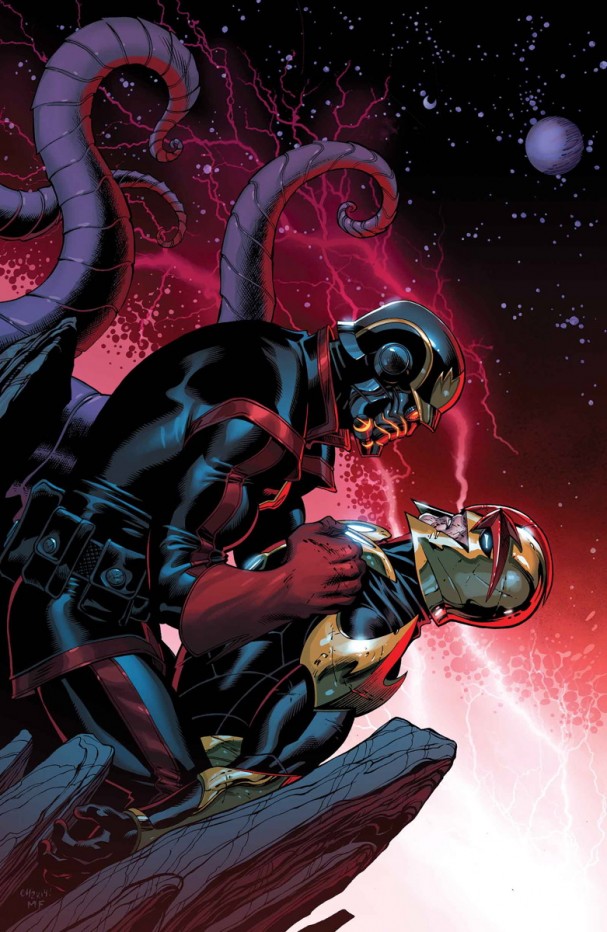
Guardians of the Galaxy #19 (Marvel) – Artist: Ed McGuinness
It’s been almost 4 years since we’ve seen this version of the Star-Lord and Nova’s Richard Rider, the latter’s whereabouts being a mystery for all fans of Marvel’s cosmic universe. Ed McGuinness doesn’t disappoint in the iconic imagery, bringing tears of joy to the followers of Dan Abnett and Andy Lanning’s epic saga, now taken up by writer Brian Michael Bendis.
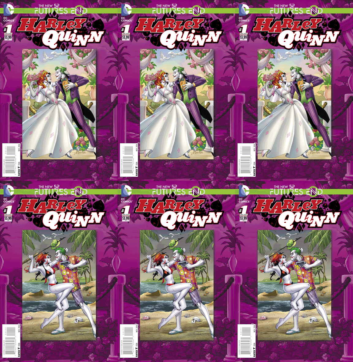
Harley Quinn: Futures End #1 (DC Comics) – Artist: Amanda Conner
All of this month, DC featured 3D covers, just as they did with Villain’s Month this time last year. The quality has been bumped up a few notches though, and this Amanda Conner piece typifies all that was best about the series. Completely mocking the event and the flash-forward “5 years later” concept, Deadpool didn’t need to troll this month: Harley Quinn is blissfully tearing it all down herself. The only thing this cover makes us yearn for is Conner to return to interiors for an upcoming issue.
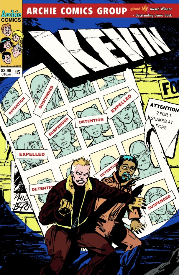
Kevin Keller #15 (Archie Comics) – Artist: Phil Jimenez
Picking up on a superhero thread that’s running through the Kevin Keller comics, former New X-Men and Astonishing X-Men artist Phil Jimenez pays tribute to John Byrne’s famous 1981 cover for The Uncanny X-Men #141, the first issue of Chris Claremont’s legendary “Days of Future Past” storyline. Capturing the oft-imitated cover perfectly, little flourishes like “ATTENTION: 2 for 1 Shakes at Pops” sells this variant perfectly.
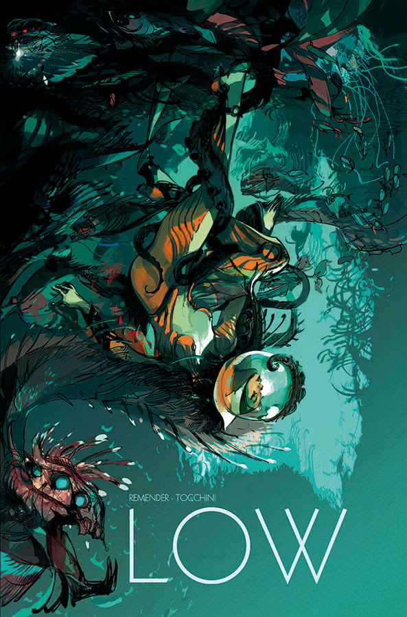
Low #3 (Image Comics) – Artist: Greg Tocchini
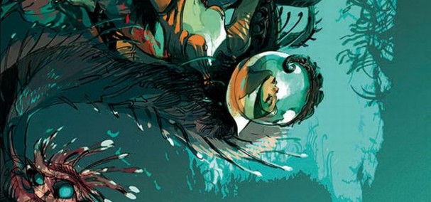
Potentially one of the most jaw-droppingly beautiful pieces of cover art for this month or any other, Greg Tocchini’s cover conveys the sense of inner and outer exploration that the book embodies. Distorting the senses immediately by turning the character (or maybe the entire frame) upside-down, Tocchini organically interweaves the character with the environment, capturing a seamless union.
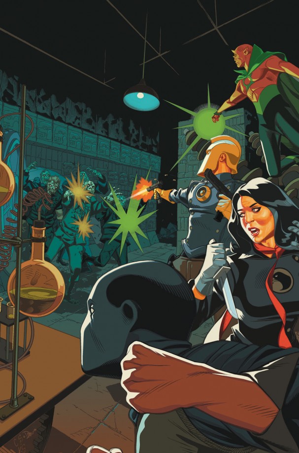
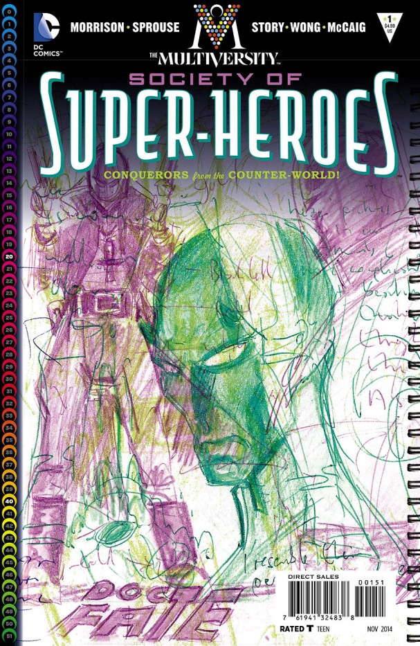
The Multiversity: The Society of Super-Heroes: Conquerors of the Counter-World #1 (DC Comics) – Artist: Chris Sprouse (left) and Grant Morrison (right)
If anything was going to make us have a hard time choosing between covers this month, it was undoubtedly Grant Morrison’s contender for the longest comic title of the year: The Multiversity: The Society of Super-Heroes: Conquerors of the Counter-World, a moniker guaranteed to use the majority of your social media characters in one hit. On one hand, everything about the Chris Sprouse cover is a wonderful tribute to the Silver Age elements of the story that Morrison so knowledgeably plays with. On the other, a cover from writer Morrison himself is a rare treat, and a glimpse into the mind of the creator.
The Names #1 (DC/Vertigo)– Artist: Celia Calle
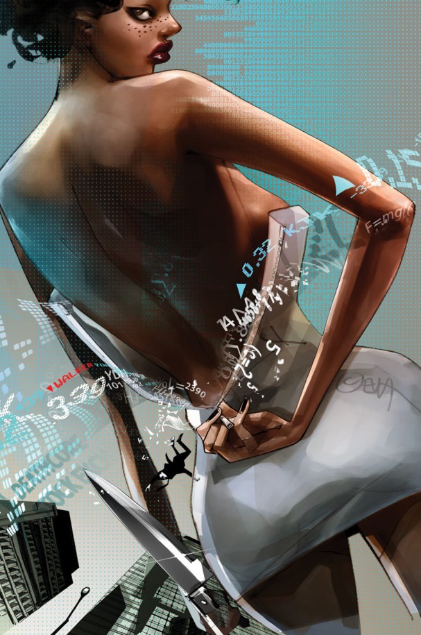
The Names is another one of the more interesting new debuts in September, another sign that we might be in (at least) the third golden age for publisher Vertigo. According to her bio, she was raised by aliens, and this is something that’s undoubtedly aided her artistic process. Readers with long memories will recall her work on American Virgin’s covers, or perhaps bits and pieces of her art from magazines and ad campaigns. Here she combines the sexiness of her central figure with elements of technology, and a hint of danger to boot.
Rocket Raccoon #3 (Marvel) – Artist: Skottie Young
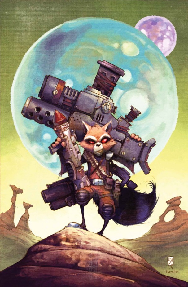
It’s no secret that we here in the Panels Cave love both Rocket Raccoon and the art of Skottie Young. This painted cover looks as though you could touch the canvas, giving it a timeless and retro feel at the same time. Plus, he’s carrying an unfeasibly large canon.
Superman Unchained #8 (DC Comics) – Artist: Dustin Nguyen
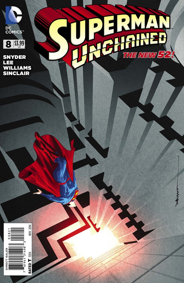
Dustin Nguyen takes a note out of artist and possible rapper M.C. Escher’s book, sending the unchained Man of Steel down into the inferno – or is it up towards the light? The heavy grey of the concrete structure that surrounds him is oppressive, making the Man of Tomorrow’s bright primary colours contrast against his discombobulating background.
A Voice in the Dark: Get Your Gun #1 (Image Comics/Top Cow) – Artist: Ben Templesmith
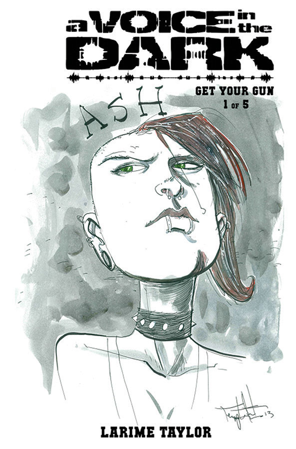
One of our favourite reads each month is Larime Taylor’s A Voice in the Dark, and Australia’s own Ben Templesmith provides the variant for the first issue of the second series. Devoid of the shadows and otherworldly glow that often characterises Templesmith’s work, it is a striking character piece with just the right amount of green and red to catch the eye. By the way, have we mentioned that you should go buy this book? Check out larimetaylor.com for details on the creator.
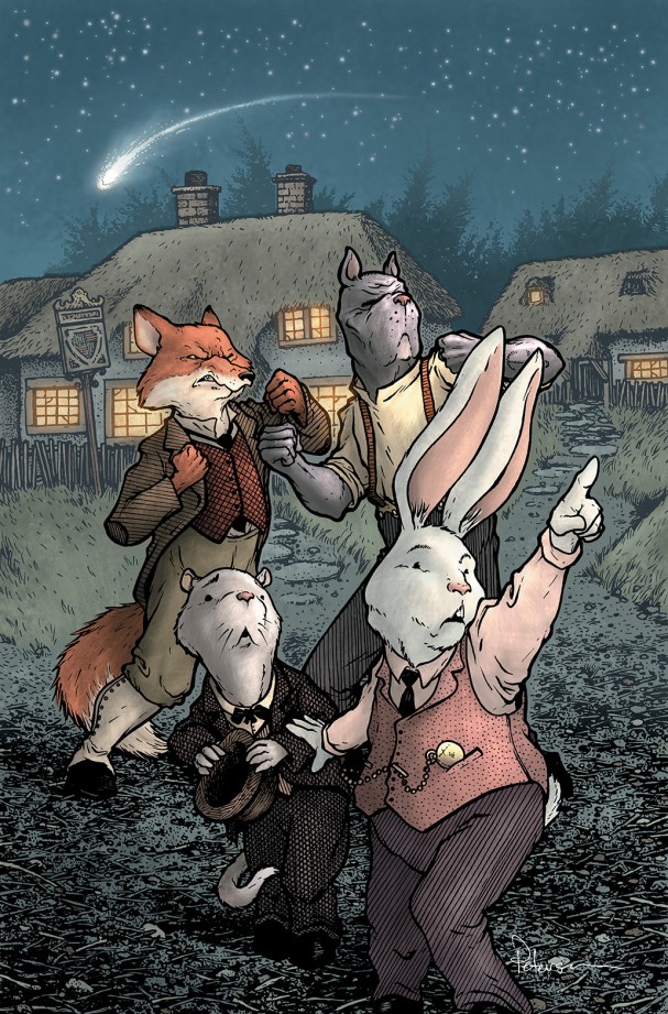
Wild’s End #1 (Boom! Studios) – Artist: David Petersen
The Mouse Guard creator is in his element on this cover for one of the sleeper hits of the year. Over at his blog, he goes into some detail about the cover process: “I decided to focus on a moment towards the end of the issue, though I combined a few things all happening at once for the sake of trying to get a lot of story info into the cover.” If you’re into process, Petersen’s blog is a goldmine of information for budding artists and critics alike.
Agree or disagree? Got a comment? Start a conversation below, or take it with you on Behind the Panel’s Facebook and Twitter!
If you are an iTunes user, subscribe to our weekly podcast free here and please leave us feedback. That’s how we get more attention on the Interwebs and move up the iTunes charts!

