Don’t have time for long reviews of comics? Then check out Graphic Bits: bite sized chunks of comic book goodness designed to get behind the panels and into your hearts.
The DC universe starts all new arcs this week (8 October 2014), with Batgirl flying off in a new direction, Batman back from his self-reflective Zero Year and Earth 2 seemingly in a state of crisis. Allons-y!
Batgirl #35
DC Comics, Cameron Stewart, Brenden Fletcher (writer), Babs Tarr, Maris Wicks (artists)
Rating: 5/10
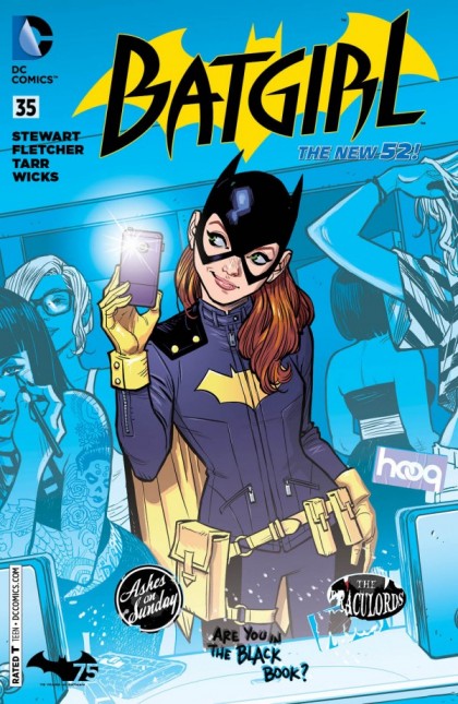 Gail Simone’s Batgirl was always going to be a tough act to follow, and it’s evident from the first page of this soft reboot that following is not in Cameron Stewart and Fletcher’s wheelhouse. Credit where it’s due, this issue (along with last week’s Gotham Academy) is a conscious attempt by DC to go for a fresh new take aimed at a younger audience who might have trouble juggling a comic book between their takeaway coffee in one hand and a smart phone in the other. Which is exactly where Batgirl falls short, mindlessly throwing in references to analogues for Tinder, Snapchat (complete with dick pics) and other social networks in place of meaningful connections with its target demographic.
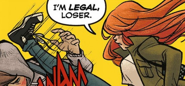
It’s a boardroom’s view of what late teens/20-somethings are up to these days, and worse still, dilutes the character for the pursuit of the “T for Teen” target demo. Babs is now all drunken nights and anonymous pashes, which some may reasonably see as a refreshing turn of the tables on treating super-heroines as objects – except that it also seems inconsistent with the character up until now. When Black Canary briefly turns up (out of costume), Babs becomes a total ditz, having apparently forgotten that she left all of her important things in Canary’s now incinerated apartment. Indeed, although remaining in continuity with the previous issues, Babs has seemingly de-aged 10 years (at least emotionally), gone back to school for the purposes of the location shift (to Gotham’s equivalent of Williamsburg) and apparently forgotten most of her awesome skills. The immediate crisis is averted by Babs swiping right on Hooq, the DCU equivalent of Tinder, and entrapping a house thief in the process. It’s all so forcefully written, with two men trying to tap into the heads of young women (figuratively we assume). Their efforts can be summed up with the line “I’m legal, loser!”
The art, on the other hand, is gorgeous. Like Gotham Academy, it’s a youthful blend of bright colours, cartoons and modern manga inspired pieces, complete with floating text messages, emails and screens. (Conversely, the Bad Guy talks in #hashtags, which is a device so lame that even Twitter is shuddering derisively right now). Designed to create the illusion of relevance, it’s the comic book equivalent of an older guy turning up to Spring Break. It’s a little creepy. Batgirl’s new costume, despite division on the Interwebs, still rocks and is sure to be the darling of the celebrity cosplay circuit in the next convention season.
Bottom Line: While it’s terrific to see DC committing to a fresh and youthful take on characters, this one seems to be trying a little too hard to appeal to a demographic that they ironically portray as being far too distracted to be of any interest in comics anyway. It’s one thing to make her more of an active young woman, it’s another to shame her smarts. Batgirl has left its old audience behind, and so now we must quietly retire into the night with our Zimmer frames and boiled lollies.
Batman #35
DC Comics, Scott Snyder (writer), Greg Capullo, Danny Miki, FCO Plascencia (artists)
“The Pale Man”, James Tynion IV (writer), Kelley Jones, Michelle Madsen (artists)
Rating: 9/10
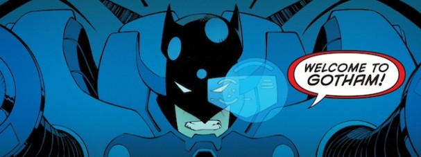
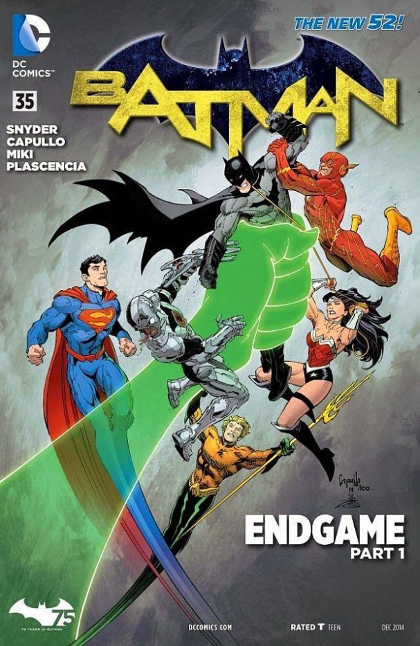 If there’s one thing that Scott Snyder has mastered in his three year tenure on Batman, it’s how to stage an opening. The elongated origin story of the “Zero Year” may have taken us out of the forward momentum of a saga that had already encompassed the Court of Owls and the “Death of the Family” arcs, and here he literally brings us crashing back to the present day in a giant suit of armour.
Troubled by visions of his own demise, Bruce works with Julia and Alfred in a new high-tech tower. It’s pleasing to see some moments of levity between Bruce and Alfred, Snyder showing that he still has a sense of humour about the Bat. Of course, the twist comes when Wonder Woman attacks Bruce by ripping him straight out the window. To reveal any more than this would be criminal, but suffice it to say that it’s a relentless smackdown of an issue that leads to one of the most genuinely unexpected endings of the book so far. It leads directly into a back-up story, written by frequent collaborator Tynion IV with Richard Corben-esque art from Kelley Jones, that is a twisted mystery of its own, and would be worth following even if the main story were not so great.
Artistically, Capullo continues to dominate. Snyder’s lengthy text in the opening pages allows us to slowly linger on the exquisite detail of the Gotham Royal Theatre, before presenting us with what has to be one of the most iconic images of the year: Batman driving a giant tank suit. Masterfully executed action sequences, sometimes dividing pages into 6 or so horizontal slices, add a sense of speed and urgency to the fights. The final page, which is one giant spoiler, is the kind of thing we are sure to see on t-shirts shortly.
Bottom Line: If “Zero Year” was about overcoming trauma and dealing recasting Batman’s origin in a contemporary setting, then the start of “Endgame” sees Snyder pushing the other end of the spectrum. Batman might ultimately be confronting his own death, or at least brushing up against it, and with those closest turning against him, this is setting up to be a killer arc.
Klarion #1
DC Comics, Ann Nocenti (writer), Trevor McCarthy, Guy Major (artists)
Rating: 8/10
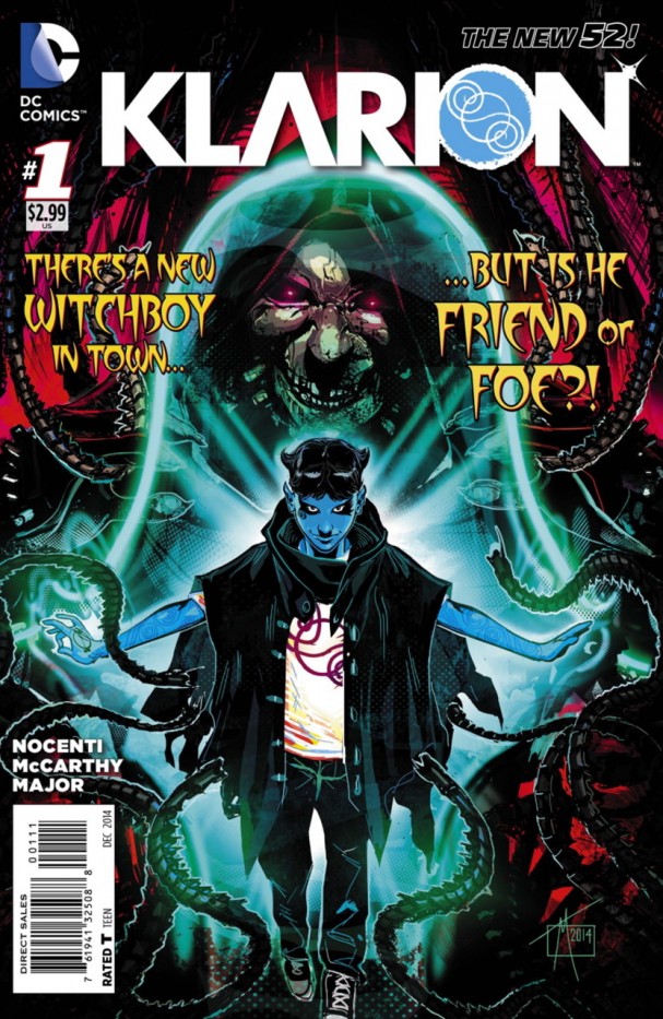 One of the strangest new additions to the New 52, Klarion the Witch Boy was a creation of Jack Kirby for The Demon back in 1973, later reworked by Peter David and Grant Morrison at various stages. Here he is presented by veteran Ann Nocenti as coming from a dimension where everyone is familiar with magic, and he takes off on a trip through the Multiverse as if he were going on a road trip.
“Trip” is about the best word to describe this issue, a psychedelic swirl of ideas that takes Klarion into a hell-like dimension where he encounters a pair of potentially star-crossed lovers. Nocenti treats Klarion and his abilities at face value, which not only throws us in at the deep end but makes for a nice change from overt exposition. There is so much happening sometimes that a re-read is in order to capture all the nuance, but Klarion is such a cheekily likeable character that it doesn’t take long to get suckered into his world.
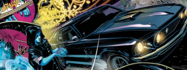
Like J.H. Williams III, artist Trevor McCarthy frames every panel in a unique way. Whether its a dizzying maelstrom of multiversity back by Guy Major’s exquisitely chosen colours, a technological framework, or the ornate illuminations of a carefully constructed borders, every page has a different layout and design. Apart from looking phenomenal, it further serves to discombobulate the reader and keep us guessing at every turn.
Bottom Line: DC’s New 52 is hitting a strong average this month with debut issues, and Klarion adds a sense of the magic surreal to the DCU that has been missing for some decades now. Nocenti’s mesmerising tale is bolstered by McCarthy and Major’s magnificent art, something that can be devoured over and over again.
Agree or disagree? Got a comment? Start a conversation below, or take it with you on Behind the Panel’s Facebook and Twitter!
If you are an iTunes user, subscribe to our weekly podcast free here and please leave us feedback. That’s how we get more attention! Go do it now. We’ll be waiting right here.





1 pings
[…] spider, a cynic might think she is simply part of a similar wave that has been dubbed the “Batgirling of the DCU“. Instead, it’s a smart and funny book, feeling for all the world like a television […]