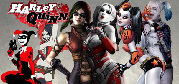
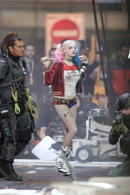
Following the release this week of a photo of Harley Quinn and some other guys from the forthcoming Suicide Squad film, two things were incredibly evident. Firstly, in just over two decades, Harley Quinn has gone from a fan favourite character to one of the more recognisable figures in the DC Universe. More importantly, that popularity has brought with it as massive image change for the character, one that emphasises Harley’s ever-changing look. Is Harley simply the chameleon of the DC universe, adapting with the times faster than any other character, or a catalyst for change in the DCU?
From TV to Comics
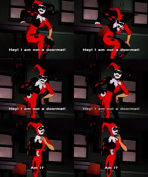 Unlike the majority of comic book characters, Harley was not actually introduced in print but rather in Batman: The Animated Series in 1993. A creation of Paul Dini and Bruce Timm, she was originally voiced by Arleen Sorkin, who in fact inspired the character when Timm spotted her as a jester during a Days of Our Lives dream sequence.
Harley, of course, went on to become a massive hit with audiences, as a friend/girlfriend/unrequited love of The Joker. She made the shift into comic books via The Batman Adventures tie-ins, and the stylistically similar Mad Love (1994) graphic novel, an award-winning recap of her origin as psychiaytrist Dr. Harleen Quinzel. Becoming fascinated with the Joker at Arkham Asylum, she is driven mad by seen her “puddin'” badly beaten, and adopts the garb of a Jester to support him in his life of chaos. As Batman describes it in the context of a flashback:
“Even from the beginning, Harley Quinn was no angel…Her real goal was a degree from the university’s prestigious psychology department. Never mind that she didn’t want to get it by studying.“
Even within the limits of the animated series formula, and the more adventurous Mad Love graphic novel, Harley was confident with her sexuality. The implication in the above quote, coupled with an image of a ruffled and “loved up” professor, is clear and dealt with completely pragmatically. From the beginning, Harley was designed to be a siren, perhaps evidenced most clearly in this clip from the 1998 The New Batman Adventure episode, “Beware the Creeper”, in which Harley suggestively emerges from a pudding for her one and only puddin’.
Her initial look in the animated series, a two-toned black and red jester outfit, remained in place for over twenty years, a stark contrast with the trends in costuming throughout the early 2000s. Since the 1990s, there has been a rise in strong female characters while at the same time some artists and authors continued to overly sexualise and de-power female characters as selling points. The Women In Refrigerators website and movement took flight in the late 1990s, aiming to analyse why women are systematically used as plot devices or objects. Yet we can see that in a matter of 10 years, the almost formless jester outfit became a catsuit, a literal Gotham City Siren by 2009. It would be naive to suggest that Harley wasn’t always a sex symbol of the DCU, but as her popularity rose and more artists came on board, it might be fair to suggest that her curvature became a selling point.

Harley Quinn: Spot the difference? (1999 – 2009)
Artists Alex Ross, Terry and Rachel Dodson, Joe Chiodo and Guillem March change Harley’s look over a decade
While it is true that Harley as a psychotic Jester, complete with giant hammer, was seen throughout DC Comics, the interpretations of that costume were reflective of this rise in popularity and specific marketing appeal of the character. Officially becoming part of the DC comics continuity with Batman: Harley Quinn #1 (October 1999), a tie-in to the “No Man’s Land” event across Batman titles. Celebrated artist Alex Ross‘ evocative painted cover, featuring Harley draping off her Joker, was perhaps solidifying her status as DC’s newest siren. Yvel Guichet’s interiors open with Harley in a ripped costume, and the tone is firmly set from there. Paul Dini’s dialogue is very tongue in cheek, especially an exchange with Joker that ends with Harley quipping “Speakin of legs…Check out these gams, puddin’.”
When Harley got her own ongoing series in 2000, it was in the skilled artistic hands of Terry and Rachel Dodson, who are known for their beautiful bombshells. The cover for Harley Quinn #1 (December 2000) is a classic piece of Dodson art, a curvaceous and distinctly proportioned character, albeit still ostensibly in the same red and black harlequin outfit she had been sporting since 1994. The first issue cleverly begins with the familiar cartoon portrayal of Harley, similar to the Bruce Timm version in the animated series, before transitioning into the Dodson style. It was a run that would define her as a solo character, see her face death, resurrection, powers and revelations for the audiences about the college suicide of a former lover that inspired her obsession with The Joker.
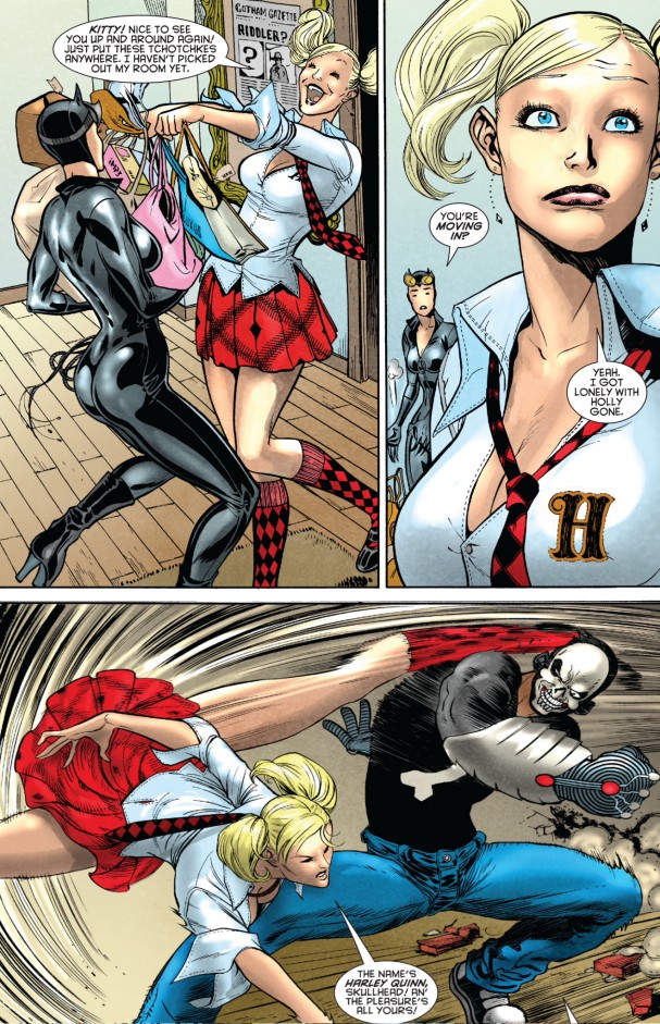
There was little mistaking the marketing intent of Gotham City Sirens (June 2009 – August 2011). After all: it’s right there in the title. The skilful Guillem March covers (above) are painted to suggest something on the edges of nudity, the kind of pin-up art that speaks more to the realms of fantasy than it does to character development. The portrayal of Harley inside the first doesn’t help terribly either: for much of the issue she is dressed as a “school girl” resembling the Britney Spears character from “…Baby One More Time.” That she is moving in with Poison Ivy and Catwoman solidifies the character in the realms of pubescent fantasy. (If March’s name sounds familiar, he hit some controversy in 2012 with the spine-bending cover to Catwoman #0).
Video (Games) Killed the Jester Star
The first major shift came for Harley’s image came in the 2009 with the release of RockSteady’s blockbuster video game Batman: Arkham Asylum. It was a game that sold over 7.5 million units around the world, and for the first time since the animated series, Harley was in a medium that more than a few hundred thousand people around the world were ever going to see. So rather than take this opportunity to reverse some of the stereotypes that had perpetuated around the character for the last two decades, they put her in a “sexy nurse outfit”.
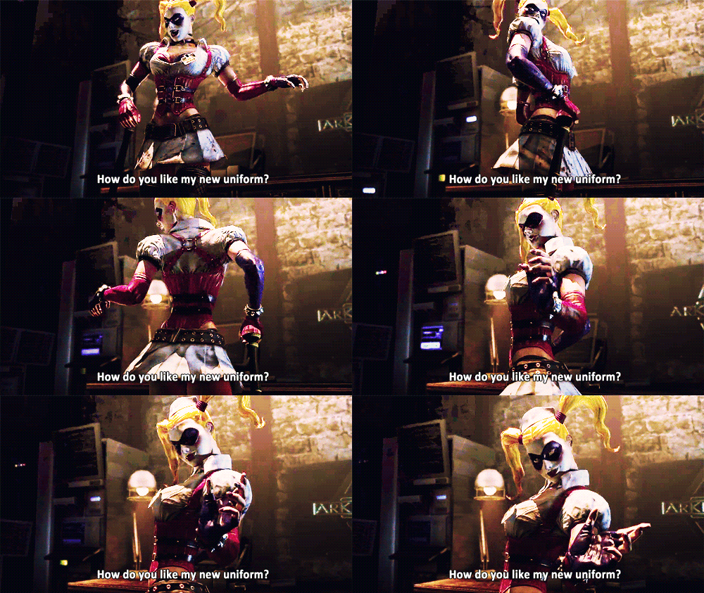
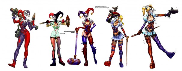
To get an idea of the line of thinking with the redesign, we can see from the Carlos D’Anda concept art below that it began with the noblest of intentions. The first design on the far left is the closest to the original Bruce Timm design, or at least the variation of it that had been used in spin-off comics in the interim. Somewhere along the line the notion of the “Sexy nurse” was introduced, filtered through a fetish version of a mallet-wielding clown, reinterpreted as a “Sexy Nurse Woman of the S.S.” by way of Rob Zombie and finally channelled into the character that we saw in the finished product. The design is a visual joke, an unlikely nurse in an asylum, a literal interpretation of “the blind leading the blind.” It’s also undoubtably one of the most radical redesign of the costume in decades, and it has set the tone for the myriad of changes that have come since.
Arkham Asylum (2009) concept art. Artist: Carlos D’Anda
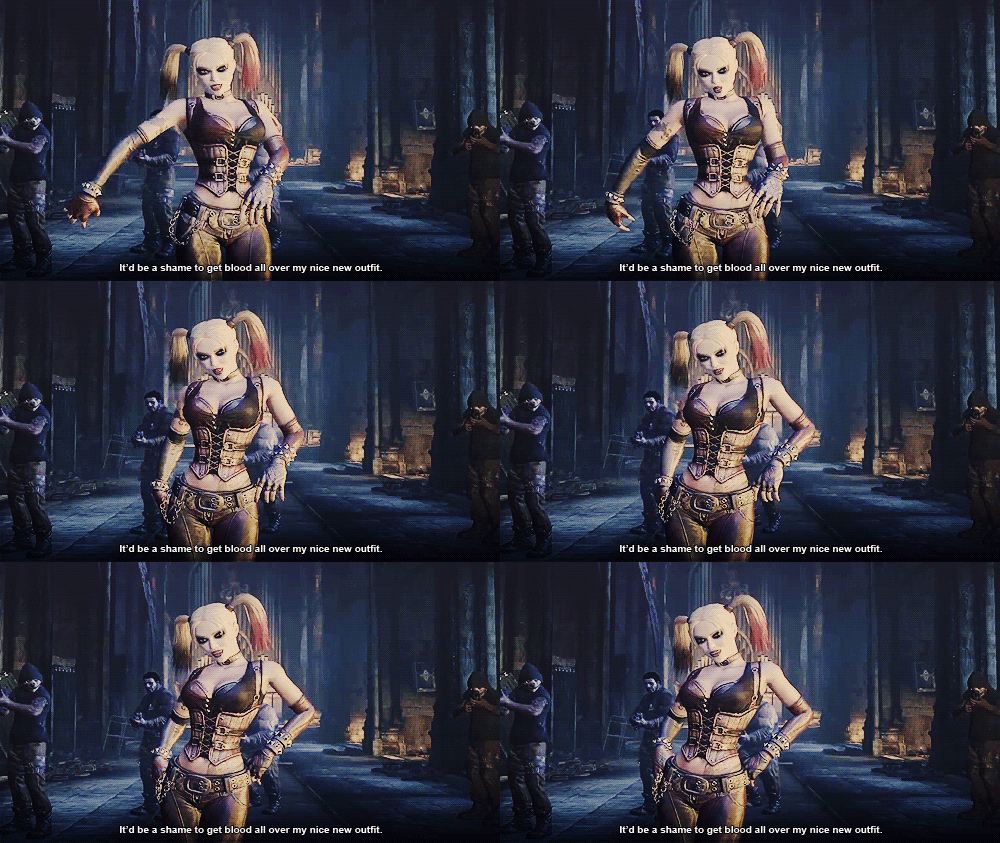
Once that initial change was made, nobody seemed to be entirely satisfied with the final design of the character. By the time the sequel – Batman: Arkham City – rolled around in October 2011, the design had changed once again. Comics Alliance documents the changes and notes that D’Anda received in the development of the updated version of the character. Among the many designs and notes they review, including elaborate headpieces and requests to give her “kinky handcuffs to highlight the playful side of Harley” and “make her belly exposed so she can wear a piercing,” the single note that perhaps sealed Harley’s (design) fate was:
“We want to completely lose the jester mask and go with this look from the neck up, adding contemporary “skunk” coloring streaks in her hair (black and red)”
This look is perhaps the most direct line-through to Margot Robbie’s version of the character, with the dipped-dyed hair, although this would certainly not be the last evolution of Harley Quinn. The video game Injustice: Gods Among Us presentded yet another version of the character, this time adopting something closer to a harlequin pirate costume that was a novel spin on Timm’s original designs.
The New 52 and DC’s Deadpool
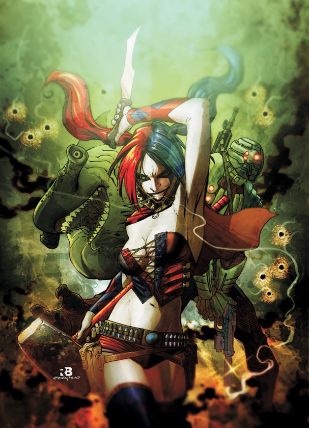
Around the same time that Arkham City was hitting shelves, DC was having its own revolution. On 31 May 2011, DC Comics made the announcement that they would “launch a historic renumbering of the entire DC Universe line of comic books with 52 first issues”. It was a bold move, one aimed at gaining new readers who “did not want to face the daunting task of knowing and understanding previous events and intimate character history”. Harley was now part of the Suicide Squad, and had a remake of her own. Like the video game counterparts, the new costume was made of a corset, although it did away with pants entirely in favour of shorts, a gunbelt and thigh-high boots. The animated character was a long way in the past by this stage.
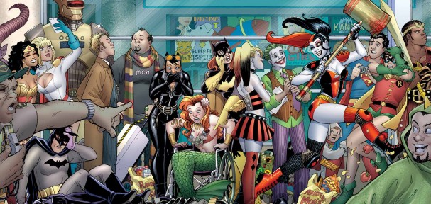
Much later in the New 52 run, Harley received a new solo series from DC, this time from the Power Girl team of Amanda Conner and Jimmy Palmiotti, with Connor providing covers and Chad Hardin on the majority of the interiors. Complementing their portrayal of Harley as a meta-aware character in the vein of Marvel’s Deadpool, complete with a special in which she visits her own creates at San Diego Comic-Con, the newer design drew far more inspiration from roller derby culture, although it has very rarely stood still for a moment.
Since the new title’s launch, Harley has actively been engaging with her audience, recognising the interchangeable nature of costume, her own brand identity and challenging the writers. A controversial Harley Quinn #0 issue asked readers to submit art that depicted the following:
Harley sitting naked in a bathtub with toasters, blow dryers, blenders, appliances all dangling above the bathtub and she has a cord that will release them all. We are watching the moment before the inevitable death. Her expression is one of “oh well, guess that’s it for me” and she has resigned herself to the moment that is going to happen.
DC apologised for the gaffe, with co-writer Palmiotti noting “Harley is breaking the 4th wall…and talking to the audience about the writers of the book…and how nutty they are.” It has done little to slow down the Harley Quinn juggernaut, the book itself selling well and spawning seasonal specials, annuals and special editions such as the Comic-Con tie-in pictured below. It’s a smart book, and incredibly funny too, arguably one of the strongest titles to enter the market from DC since the inception of the New 52. Indeed, she is the closest to being the funny cartoon character that Bruce Timm and Paul Dini introduced over twenty years ago.
Designed to appeal
The latest look for Harley Quinn is, of course, the revelation of the photos from the set of Suicide Squad, where the character has adopted a more contemporary look. Ripped t-shirt with “Daddy’s Little Monster” scrawled across it, sparkling two-toned shorts (now red and blue), a baseball bat and tattoos that declare her to be the property of Joker. Beyond these images we know nothing of the character, but as we’ve seen from twenty years worth of Harley Quinn outings, an image can say a hell of a lot.
So why do the multiple changes to this particular character stand out the most? Maybe Harley hasn’t changed over the years as much as her costume has, but perception of that character has as well. In the early days of the harlequin costume, perhaps there was a childlike innocence to the character, and in the last few years we are now witnessing the “adult” Harley for the first time. Comparisons in popular media abound, whenever a tabloid declares their shock at Lindsay Lohan or Miley Cyrus sporting a new look at odds with their child star fame. Male heroes don’t have to contend with quite the same scrutiny: for them, the core costumes remain effectively the same, but the bodies underneath grow to impossibly large scales of manhood. Perhaps any reaction against modern depictions of Harley is merely a recognition in readers that they have also grown up since the inception of the character.
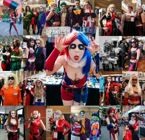
Yet many audiences adore the cult of Harley, and it is difficult to attend a comic con without seeing her warmly embraced by dozens, if not hundreds, of cosplayers at every event. Indeed, the montage below represents just a small sampling of the Harley Quinns that we’ve personally encountered in the last three years at Australian (and one US) cons. Perhaps Harley is simply the spirit of the zeitgeist, changing into whatever she needs to be – whatever her audience needs her to be – in order to fulfil the desires of the fan base.
Or maybe she’s just crazy and cool.
Agree or disagree? Got a comment? Start a conversation below, or take it with you on Behind the Panel’s Facebook and Twitter!
If you are an iTunes user, subscribe to our weekly podcast free here and please leave us feedback.






1 pings
[…] the most exciting part for fans, apart from some lingering additions to the evolution of Harley Quinn’s screen presence, is the first proper footage of Jared Leto’s The Joker. It will do little to assuage the […]